Yasiru Senarathna
Lead UX Designer
Yasiru is the Lead UX Designer at Merge. With a deep expertise in SEO and technical optimization, he specializes in building high performance digital experiences.
- Feb 08, 2026
- 8 min read
The Perfect Landing Page Structure for 2026: Why "Brochure" Websites Are Dead
In 2026, a "pretty" website isn't enough.
If you are sending traffic to a homepage that looks like a digital business card, you are burning money. The modern user whether a tech CEO in San Francisco or a business owner in Colombo has an attention span of less than 3 seconds.
They don't want to hunt for information. They want to know if you can solve their specific problem.
Based on the latest data from 2026 design trends and strategies from top entrepreneurs like Daniel Priestley (author of Oversubscribed), we've broken down the exact anatomy of a high-converting landing page.
Here is the blueprint for a page that doesn't just look good it sells.
1. The Problem Led Hero Section
The "Welcome to our website" headline is dead.
In 2026, the most effective Hero sections don't talk about you; they talk about the user's pain.
- The "Frustration" Headline: Use a hook that speaks to the problem they are currently facing. (e.g., "Frustrated That You’re Spending Thousands on Ads but Getting Zero Qualified Leads?")
- The "Readiness" Sub-Headline: Pivot to the future they want. (e.g., "Ready to build a predictable client acquisition system in the next 90 days?")
- The Visual: Avoid generic stock photos. Use a high-quality image or loop video that shows the outcome of your service.
Sri Lanka Geo-Hack: Heavy video backgrounds kill conversion rates on slower 4G networks. For local pages, use next-gen image formats (AVIF/WebP) to ensure your Hero loads instantly, even in rural areas.
2. The Trust Battery (Instant Credibility)
Before you explain HOW, prove that you CAN. Place a "Trust Bar" immediately under your Hero section.
- International: Display logos of recognized partners (Stripe, AWS, Forbes) or a "Rated 4.9/5 on Trustpilot" badge.
- Sri Lanka: Trust is local. Displaying logos like PayHere, SLIIT, or well-known local brands builds instant familiarity.
3. The Interactive Lead Magnet (The 2026 Game Changer)
Stop asking for marriage on the first date. Most websites ask a cold visitor to "Book a Call" or "Buy Now" immediately. This is high friction. The 2026 trend is the Micro-Commitment or Scorecard Marketing.
Instead of a contact form, offer value first:
- The Strategy: "Take our free 2-minute audit to see why your marketing is failing."
- Low Friction: People love learning about themselves.
- Data Goldmine: You don't just get an email; you get their budget, their timeline, and their biggest pain point before you ever speak to them.
- Qualification: You filter out the "tire kickers" automatically.
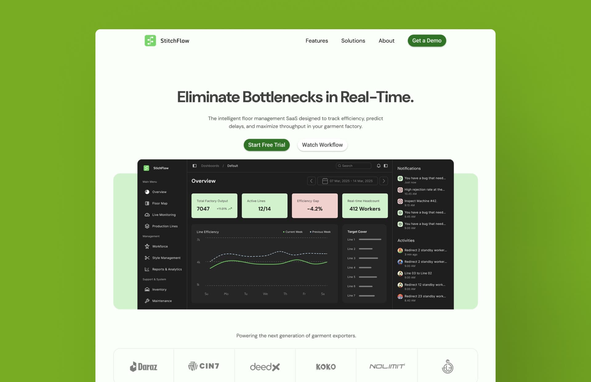
4. The Bento Grid Value Breakdown
Bullet points are boring. Modular design is in. Organize your key benefits into a Bento Grid a modular layout that makes complex information easy to scan and visually engaging.
The Emotional Hook
Stop losing sleep over empty pipelines. We build systems that give you the freedom to focus on what you love, knowing your growth is automated and predictable.
85%
Failure Rate
Most businesses fail without a conversion system. Ours is battle-tested.
Visual Proof
Real-time tracking of every lead.
Rapid Setup in under 14 days
5. The Geo Optimized Conversion Block
This is where your strategy must split based on location. A user in London behaves differently than a user in Kandy. You must adapt your Call to Action (CTA) to the market.
For International Clients (US/EU/AU)
The Goal: A Scheduled Meeting.
The Tool: Embed a calendar (Calendly or Cal.com).
The Psychology: Western clients value efficiency and structure. They want a Zoom link and a calendar invite immediately.
For Local Clients (Sri Lanka)
The Goal: Instant Conversation.
The Tool: WhatsApp Integration.
The Psychology: Sri Lankans prefer chatting over filling out forms.
Do this: Use a sticky "Chat on WhatsApp" button.
Pro Tip: Pre-fill the message. Make the link type: "Hi Merge, I saw your wedding templates and want to know the price." This reduces friction and increases inquiries by 40%.
6. The Founder's Hello (Human Connection)
People buy from people, not logos. In an age of AI-generated content, being human is a competitive advantage. Add a short, simple video of the founder addressing the visitor directly.
"Hi, I'm Yasiru. We built this agency because we were tired of seeing businesses get overcharged for websites that don't work. Here is how we do it differently..."
7. The FAQ (The Objection Killer)
Answer the questions they are afraid to ask. Don't bury your FAQs on a separate page. Put them right before the final footer. Address the "Elephant in the room":
- "Is this a subscription?"
- "How long does it take?"
- "What if I don't like the design?"
Is Your Page Ready?
- The Hook: Does your headline address a specific frustration?
- The Micro-Commitment: Are you offering a Quiz or Audit instead of just "Contact Us"?
- The Speed: Does it load in under 2 seconds?
- The Local Touch: Are you using WhatsApp for SL and Calendly for Global?
Need a Landing Page That Actually Sells?
At Merge, we don't just design websites; we build conversion engines. Whether you are targeting high-end clients in Europe or the bustling market in Colombo, we build the structure that fits.
Ready to Create?
Have an Idea? Let's Discuss It.
From early concepts to full builds, we're here to help you move forward.